WMC Training
Branding
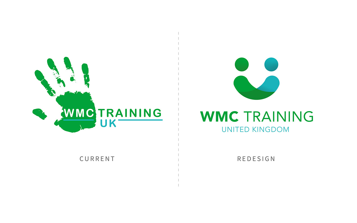
This project came from a recommendation on Facebook, soliciting the services of a designer capable of completing a logo redesign within a tight four-day deadline.
After expressing my interest, I was introduced to WMC Training, a company specialising in workplace training, online childcare courses, and recruitment services. The client provided me with a brief, sharing their competitor's logo and a sketch of a hand in a cupping position, asking that I incorporate these elements into the redesign if possible.
I began with research, sketching and brainstorming, ultimately narrowing my initial concepts to three strong designs. Their chosen design had multifaceted meanings, evoking distinct impressions depending on the viewer's interpretation. It accomplishes this by featuring a figure with arms embracing one another, symbolising care and guidance, a handshake representing achievement and fulfilment, and a smiling expression of amity and affability.
Despite the tight deadline, I produced a logo that fully met the client's needs, and they were satisfied with the concept as presented, making no requests for revisions or changes.
Despite the tight deadline, I produced a logo that fully met the client's needs, and they were satisfied with the concept as presented, making no requests for revisions or changes.
Subsequently, I worked on creating brand guidelines that included the new logo in various colour ways and orientations, providing the client with the necessary tools to move their brand forward with confidence.
Sadly I learnt a valuable lesson myself while working on this project. After submitting the design and sending a quote before starting the work, the client suddenly changed their position and decided that the price was too high and went with an alternative, cheaper client.